1. 前言
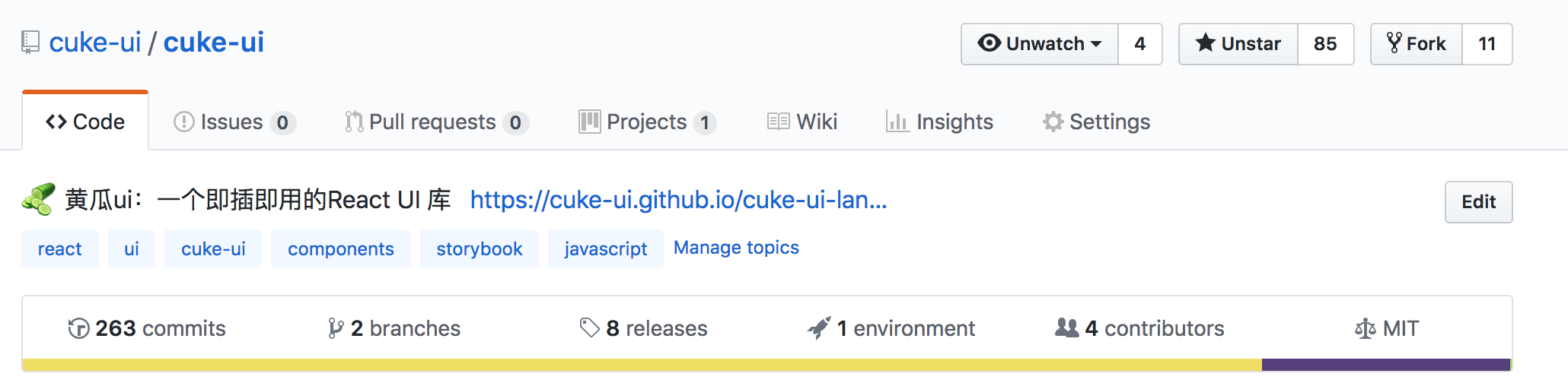
2018 年马上结束啦,今年是 充实忙碌的一年啊,年中有一天脑壳一热,突然想开发一个 React 组件库,之前偶尔写过一些 小玩具,所以想能不能写一个 大玩具呢?庆幸自己不是三分钟热度,花了三个月时间,周末,和工作日休息时间,搞了一个 cuke-ui 在这里,记录一下心得吧
2. 组件化
2011 年 我还在读初中,Twitter 的两位大佬,由于 老板给他们安排的工作太多了,很多重复性的东西,由于他们太懒了,一不小心就 开发了 Bootstrap, 这个东西不用多说,虽然我不太喜欢,但是它无疑是 最火,最早的一批 前端 Ui 库,也是在那时候,我认识到,能 CV 编程 尽量 不 BB 的重要性
到现在 三大框架 一统天下,组件 成了不可或缺的一部分,各种 UI 库 层出不穷。最火的还是当属 antd , 于是 我觉得 借鉴 (抄袭) 一波,开始干活了
3. 搭建项目
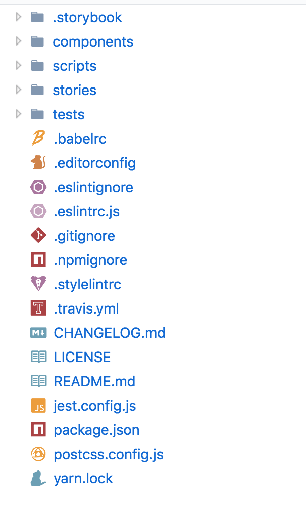
.storebookstorebook 的一些配置components参考的 antd, 放置所有组件scripts发布,打包,相关的一些脚本stories项目静态文档,负责 demo 演示tests测试相关的一些setup
其他就没啥说的,全是一些常规文件,不得不吐槽 现在搭个项目 需要的配置文件越来越多了
3.1 storybook 搭建网站
一个组件库 肯定需要一个 演示 demo 的静态网站 , 比如 antd 的 Button 对比了一下,选了一个 比较简单的 storebook 来搭建网站
1 | import React from 'react'; |
编写 stories
1 | import React from 'react'; |
再配合 webpack.config.js 就基本完事了,配置就不贴了,常规操作
这时候 看效果
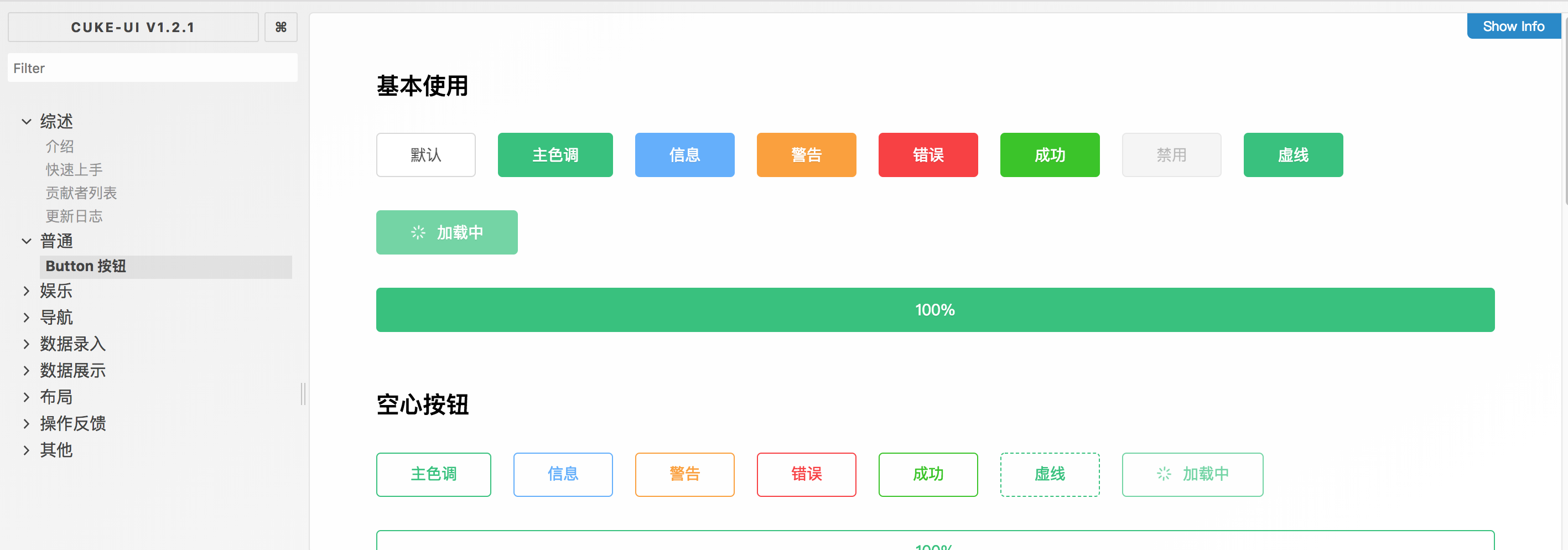
哇塞,好像是那么回事,美滋滋,这里虽然几句话 就讲完了,实际我撸的时候 , 还是遇到了很多 很繁琐的麻烦,比如 webpack4 babel@7.x 与 storybook 版本不兼容啊 之类的,各种搜 issue 啊,好在最后解决了
storybook 提供了 一个 静态发布 插件 , 这样解决了我最后一个问题,发布到 github 的 gh-page , 添加两行 npm scripts
1 | "scripts": { |
然后运行
1 | yarn pub:docs |
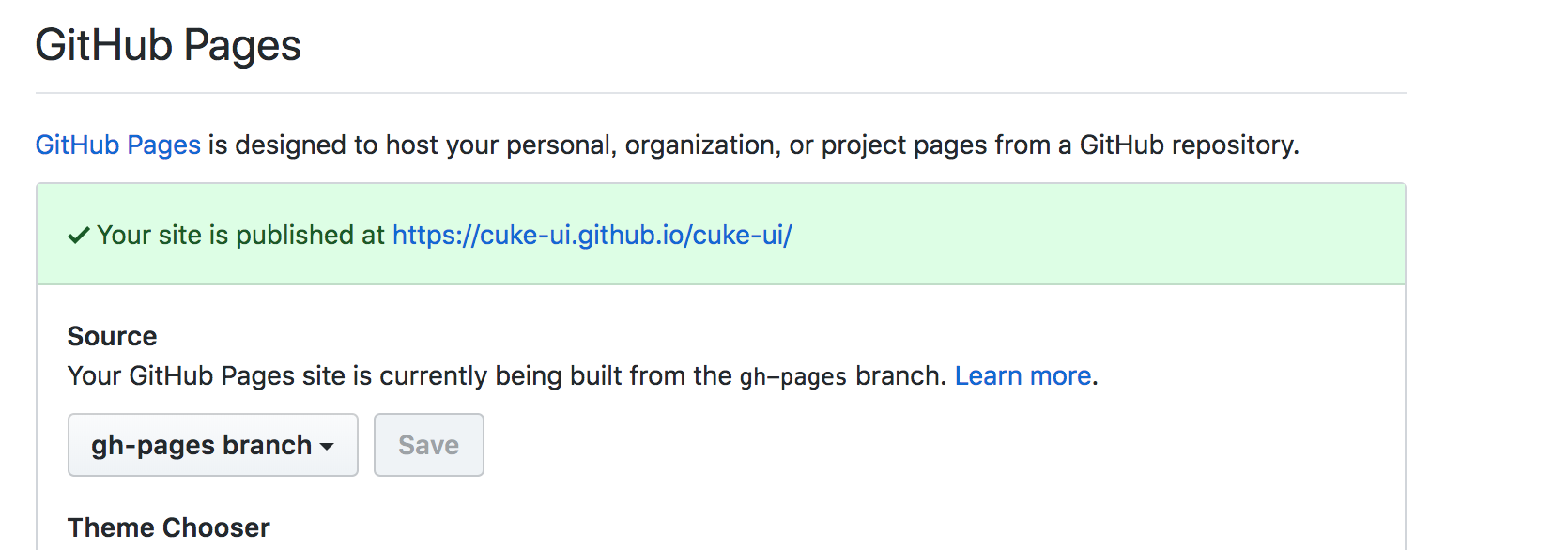
原理很简单,先通过 webpack 打包文档,然后 git add . 然后 push 当 远端的 gh-pages 分支,
可以通过 repo => Setting => Github Pages 看到当前 部署好的 静态网站
3.2 开始编写组件
网站搭好了,相当于买好了 厨房用具,可以开始 炒菜了,菜在哪里?好吧,还要自己种菜,现在我们 开始 种 Button 这个菜
1 | cd components && mkdir button |
在 components 目录 下 新建一个 button 目录
__tests__// 测试index.test.js
index.js//组件入口styles.less//组件样式
1 | // index.js |
// styles.less
1 | @import "../styles/vars.less"; |
1 | // index.test.js |
这样就写好了 组件了,我们假设 这个组件库暂时只有一个 Button 组件,最后只剩一件事 , 发布到 npm
让用户 可以向下面这样使用
1 | import { Button } from "cuke-ui" |
3.3 编写打包配置
通常组件库 会提供两种 引入的方式
- 通过 babel 打包的方式
1 | babel components -d lib |
- 通过 script 标签引入的
UMD通用模块规范
1 | <link rel="stylesheet" href="https://unpkg.com/cuke-ui@latest/dist/cuke-ui.min.css"> |
我以前写 插件的时候 只用过 第一种方式,第二种也是放各种开源项目的代码才知道 原来可以通过 webpack 打包 umd
1 | // scripts/build.umd.js |
这里 使用 webpack4 所以指定 mode 为 生产环境,自动帮你优化,重点说下 entry 和 output
找到打包入口 componnets 下面的 index.js , 然后 输入到 dist 目录,生成一个 cuke-ui.min.js,
这时候发现 其实我们差一个 入口文件
1 | // components/index.js |
这里 把 默认模块 导出 取了一个别名,好处就是 可以统一管理 暴露给用户的 组件名字
最后 我们 在 npm scripts 添加一条命令,不用每次手动去打包
1 | "clean": "rimraf dist && rimraf lib", |
clean是为了 防止 dist 和 lib 目录有无修改的情况,每次打包前先删除,build:lib通过 babel 打包到es模块到lib目录build:umd刚才已经解释过了
这时候 运行
1 | yarn build |
js 相关的部分倒是没问题了,现在以及可以直接使用了
1 | import { Button } from './lib'; |
1 | <script type="module"> |
这时候会发现其实 还缺少对 css 的打包,再加把劲,加上 gulp 的配置
这一段配置 抄袭的 dragon-ui 的 配置,稍微改了下
1 | const path = require('path'); |
这段代码 找到 components 下面 所有 的 less 文件 压缩编译后,打包到 dist 目录 , 生成 cuke-ui.min.css 文件
4. 发布组件
相信大家都知道怎么发布 npm 包 这里就不在赘述,大概贴下代码
1 | // package.json |
指定 该 库的 根目录是 lib/index.js
当用户 yarn add cuke-ui 之后 使用
1 | import {Button} from 'cuke-ui' |
可以理解为 对应的是
1 | import {Button} from './node_modules/cuke-ui/lib/index.js' |
编写相关相关的描述后就可以发布了
1 | npm publish . |
如果是测试版,加一个 --tag 即可
1 | npm publish . --tag=next |
5. 编写其余组件
其他组件,虽然各自逻辑 不一样,但是套路是差不多的,经过我的努力奋斗,完成了以下 组件,下面重点说一些值得说的点
- Button 按钮
- Alert 警告提示
- Breadcrumb 面包屑
- Grid 网格布局
- Input 输入框
- Message 消息提示
- Modal 对话框
- Pagination 分页器
- Tooltip 文字提示
- TurnTable 抽奖转盘
- WordPad 手写输入板
- MusicPlayer 响应式音乐播放器
- Spin 加载中
- BackTop 回到顶部
- Progress 进度条
- Tabs 选项卡
- Badge 徽标数
- Dropdown 下拉菜单
- Drawer 抽屉
- Radio 单选框
- Container 包裹容器
- Affix 固钉
- Timeline 时间轴
- Checkbox 复选框
- Switch 开关
- Tag 标签
- CityPicker 城市选择框
- Collapse 折叠面板
- Select 下拉选择器
- DatePicker 日历选择框
- Notification 通知提醒框
- NumberInput 数字输入框
- Steps 步骤条
- Upload 上传
- Calendar 日历
- Popover 气泡卡片
- PopConfirm 气泡确认框
- Card 卡片
5.1 消息提示类 组件
message, notification
理想的状态 是 直接用 api 的方式调用
1 | import { message } from 'cuke-ui' |
利用 class static 静态属性 轻松实现这一点
1 | static renderElement = (type, title, duration, onClose, darkTheme) => { |
把每一个 类 的 static 方法 当做一个 api, 然后调用 api 时,在 body 创建一个 ‘div’, 通过 ReactDOM.render 方法 渲染出来
5.2 弹窗提示类 组件
Modal
在 react-dom 提供了 createPortal api 后,编写 弹窗类组件 变得 异常简单,也就是通过所谓的传送门,将 dom 挂载 在 body 下面
1 | return createPortal( |
Tooltip
Tooltip 实现有两种选择,一种直接 绝对定位在 父元素,这样会少一些 计算代码,但是会带来一个问题
1 | <span ref={this.triggerWrapper} className={cls(`${prefixCls}-trigger-wrapper`)}> |
如果 父元素 有 overflow:hidden 之类的属性 tooltip 可能会被截取一部份,所以采用第二种方案,挂载在 body 上 通过
1 | this.triggerWrapper = React.createRef(); |
拿到当前 的 位置信息 , 动态赋给 当前 div, 最后 绑定一个 resize 事件,解决 窗口改变之后 位置不对的问题
1 | componentWillUnmount() { |
5.3 初始化动画闪烁问题
在 很多 组件 需要淡入淡出动画时 我会绑定两个 class , 对应淡入和淡出的 动画
1 | state = { |
这时候会出现一个问题,在初始化的时候 因为 visible 默认是 false 所以 会执行 close 动画 , 导致 闪烁,所以 只需要 初始化 把 state 设为 null, 当 null 时 将 css 设为 animation:none 就解决了
5.4 统一的视觉风格
为了以后维护 和 换肤,需要维护一份统一的变量,所有组件统一引用
1 | //vars.less |
5.5 巧用 React.cloneElement
在 编写组件的时候,经常配到需要配套的 问题,比如 Collapse
1 | <Collapse rightArrow> |
<Collapse> 和 <Collapse.Item> 都是我们提供给用户的 组件 需要配套使用,比如上面的例子 , 有一个 rightArrow 属性 告诉每个 <Collapse.Item> 箭头都在右边,这时候就需要 通过 cloneElement 传值给 子组件
1 | // collapse.js |
每个子组件 在拿到 父组件的 rightArrow 属性后 就可以设置对应的 class , 类似的 Row Col, Timeline 实现方式都是如此
Ï
5.6 getDerivedStateFromProps
在很多组件 都有类似的场景 state 需要依赖 props 的某一个属性
1 | <Tabs activeKey="1"> |
比如上面这个 Tabs 组件 接受 一个 activeKey 来 渲染当前是 哪一个选项,组件可能长这样
1 | export default class Steps extends PureComponent { |
初始 有一个 activeKey 记录当前的索引,每次点击 改变 索引值,这时候就会有一个问题,如果 props 的 activeKey 更新了,这时候 state 不会更新,所以需要用到 getDerivedStateFromProps 这个生命周期,在每次 props 改变之后 比较 props 和 state 的 activeKey 是否一样,如果不一样 则更新
1 | static getDerivedStateFromProps({ activeKey }, state) { |
6. 使用 antd-landing 生成一个 网站首页
经过不断的努力改造,组件倒是开发的差不多的,但是还差一个 像 https://ant.design/index-cn 这样酷炫的首页,通过一番搜寻,发现了 antd-landing 拖拖拽拽,可视化的搭建好了 网站首页

最后 只需要 手写一些 webpack 配置 , 打包好发布到 github page 即可
7. 结语
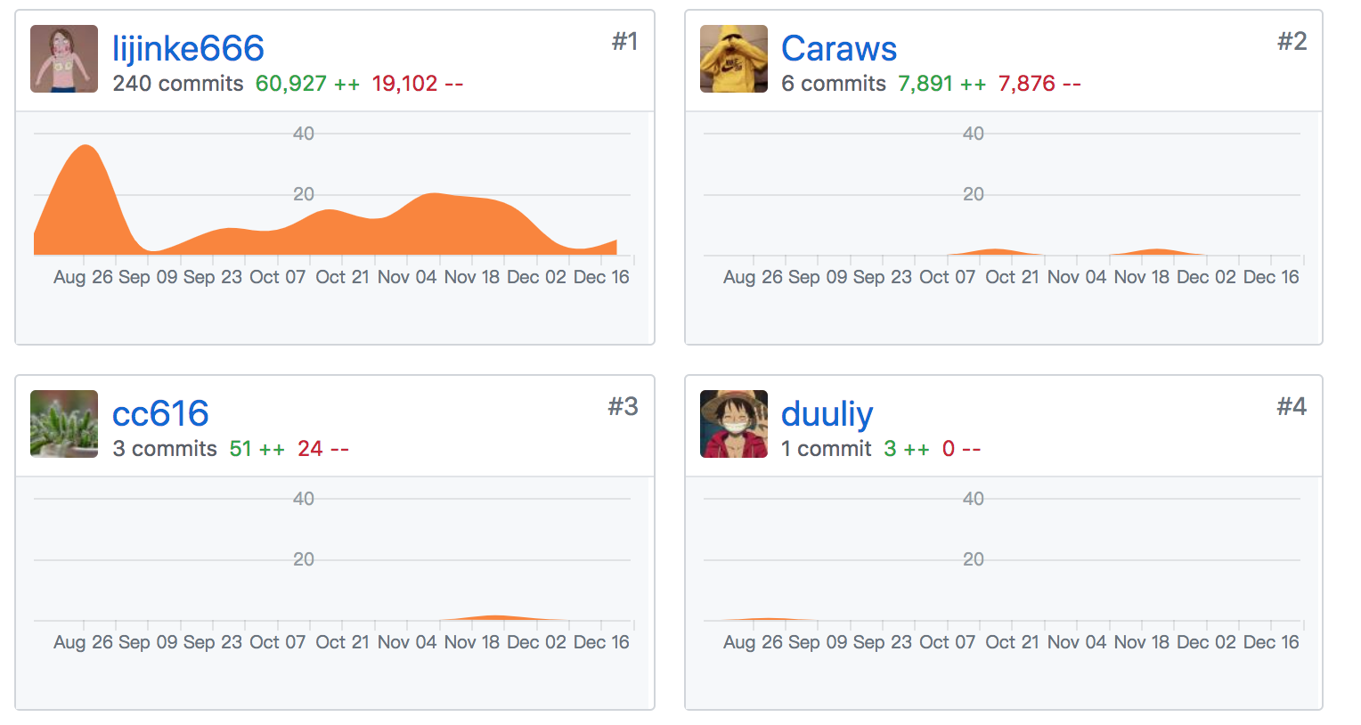
没错,又是一个 类 antd 的库,也许没啥意义,通过这个 组件库,我学到了很多 平时 接触不到的知识点,也体会到了平时 框架,库作者的辛苦,真心不容易,吃力不讨好,也得到了 偏右 等大佬 的 star, 同事也很热心的帮我提了一些 Bug fix 的 PR, 不管怎么说,今年的学习目标完成了,还是美滋滋的,明年一月份 开始 搞 nest 和 flutter 了,加油吧 骚猪